
Decisions Made
Tiling & Flooring Selection

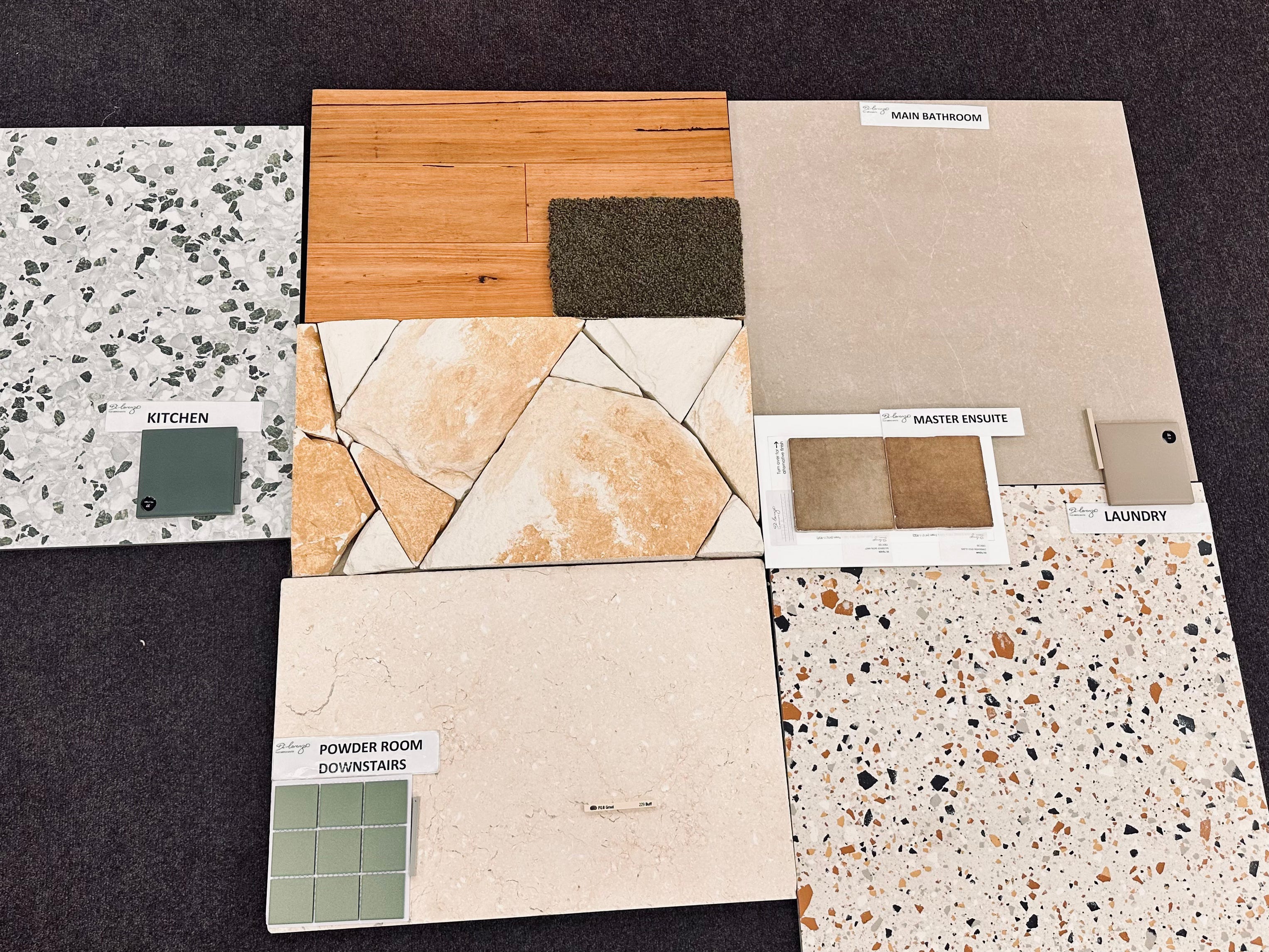
This morning I made some DEFINITE decisions. As distinct from wish lists, preferences and “isn’t that lovely!” I presented myself at the builder’s preferred tile & flooring supplier, Di Lorenzo Tiles Northmead, and got down to details with the helpful sales lady, my new friend Anna.
Decisions — right down to the grout colour.
Unbelievable as this may sound, given that a sod has not yet been turned at the block, we chose GROUT COLOURS. And underlay thicknesses. I mulled over choices of ‘satin’ or ‘matte’ or ‘gloss’, over ‘smooth’ or ‘rustic’, over ‘plain’, ‘variable’, ‘porcelain’, ‘stone’.
Decision Fatigue?
You might think I’d be knocking back a glass of wine right now, overcome with Decision Fatigue, but no—it took Anna and I only two hours to lock in all the choices, mainly because of the two and a half years I’ve spent so far brooding over these decisions.
Instead of Decision Fatigue, I feel only Relief. And maybe a splash of ‘Proud of Self’.
I can also report that I was able to make my selections almost within the builder’s budget provisions, especially for the biggest choices such as wood floors, sandstone features, and wall & floor bathroom tiles. I might have gone a bit over budget with feature tiles, and I know I went way over on the carpet, and on the flooring for the alfresco area.
But overall, Anna seemed confident that I didn’t blow the ‘allowances’ too much.
Wood Floors
It is, thus, with pride and relief that I can report that the wood floors throughout the house will be engineered wood in Blackbutt, as wish-listed almost from the start. I had to push this one a little—Anna needed to check online. There was only one sample. Was it still available? I waited, wondering how much of the budget would need to be blown, because there was no way my floors were not going to be Blackbutt. For all kinds of good reasons I’ve posted about before.
Then the good news: available, suppliable, and only $4 per square metre over the budget allowance. *phew*
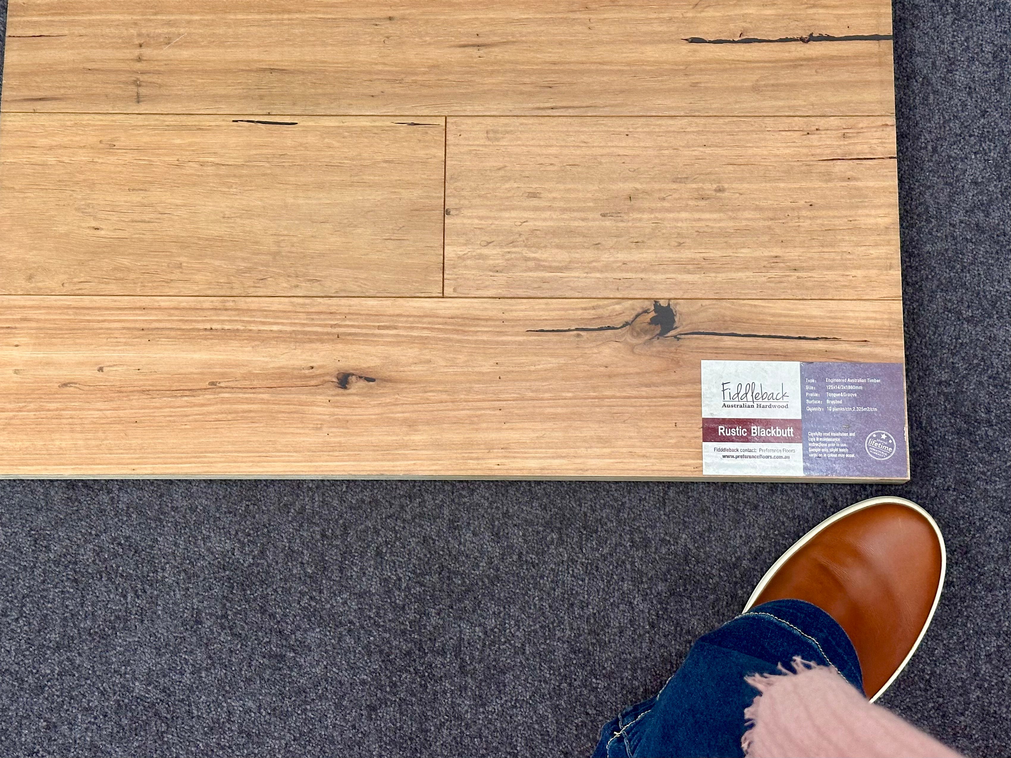
Blackbutt it is
Carpet
I have had an expensive pure wool carpet on my wish-list for ages, and I refused to be seduced by other options. Cheaper ones, for example. This was one choice on which I was prepared to stretch the budget. Luckily, the brand I prefer, the New Zealand company Bremworth, is distributed by Anna’s business. I knew the name of the carpet I wanted—Galet in ‘Sage’. She is going to source it for me.
Bremworth’s ‘Galet’ in ‘Sage’
Yes, it’s a difference of about $150 extra per square meter, but as Anna and I kept saying to each other, “it’s only one room.” This is the way budgets get blown.
I was also introduced to three samples of carpet underlay thicknesses—8mm, 9mm, 11mm. Who knew? Of course the thinnest was the one allowed for in the budget. But after pressing and testing samples, I decided it would be fine, since the premium carpet itself is a hefty 15mm thick.
Sandstone
The big sandstone feature wall that is the signature of the house’s façade, and which runs through into the foyer and also clads the fireplace surround, will be not real stone, but a reconstituted product. ‘Sandstone cladding’, also known as ‘veneer stone’. However, it looks like sandstone, so that’ll be fine. It’s also easier to install, so that’s a plus. I’ve posted about this before.
The budget allowed for this product, and all I had to do was confirm the colour choice. Though the paler stone looked good, I went for a warmer colour, more like the real thing.
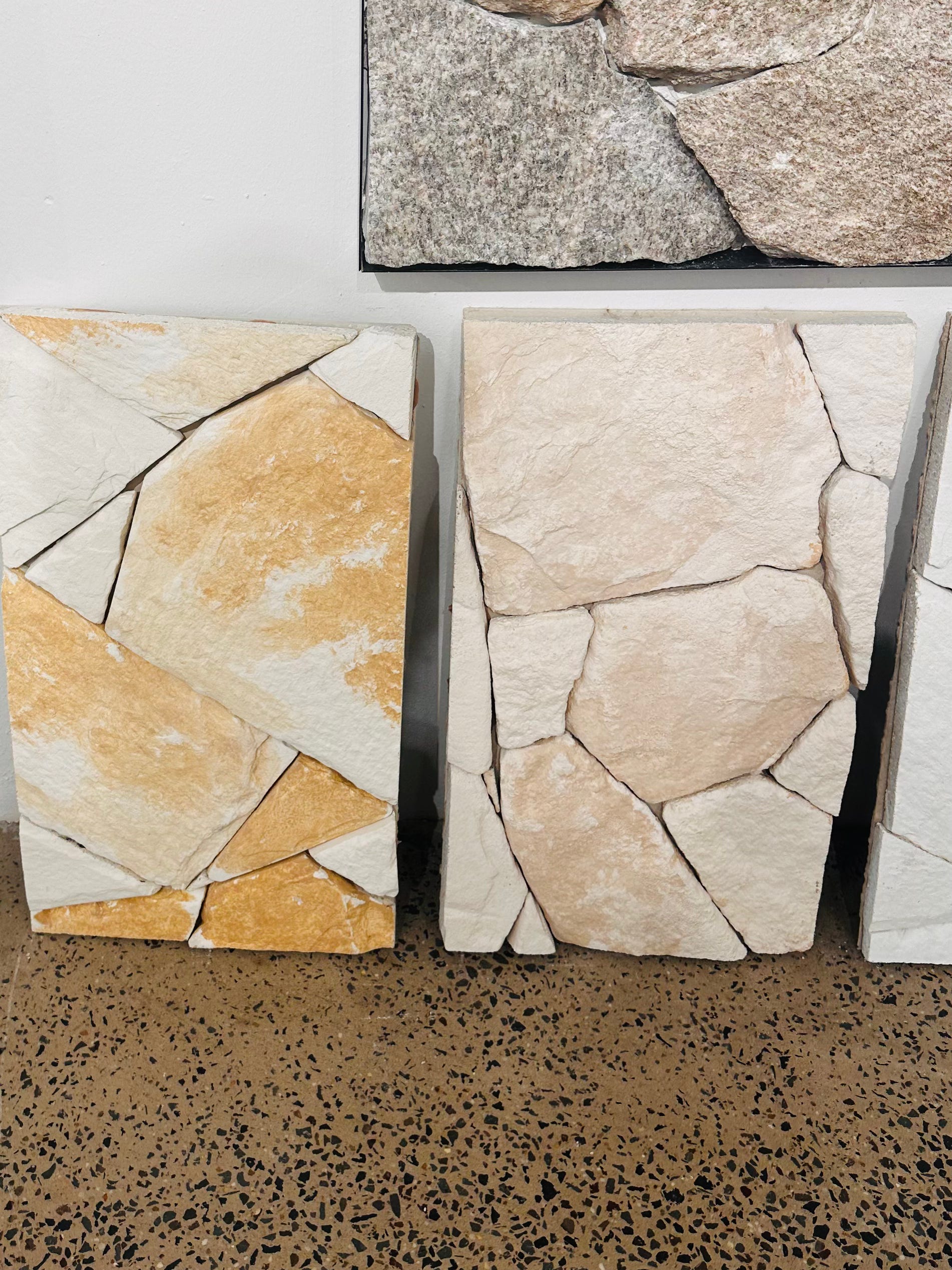
‘Sandstone cladding’
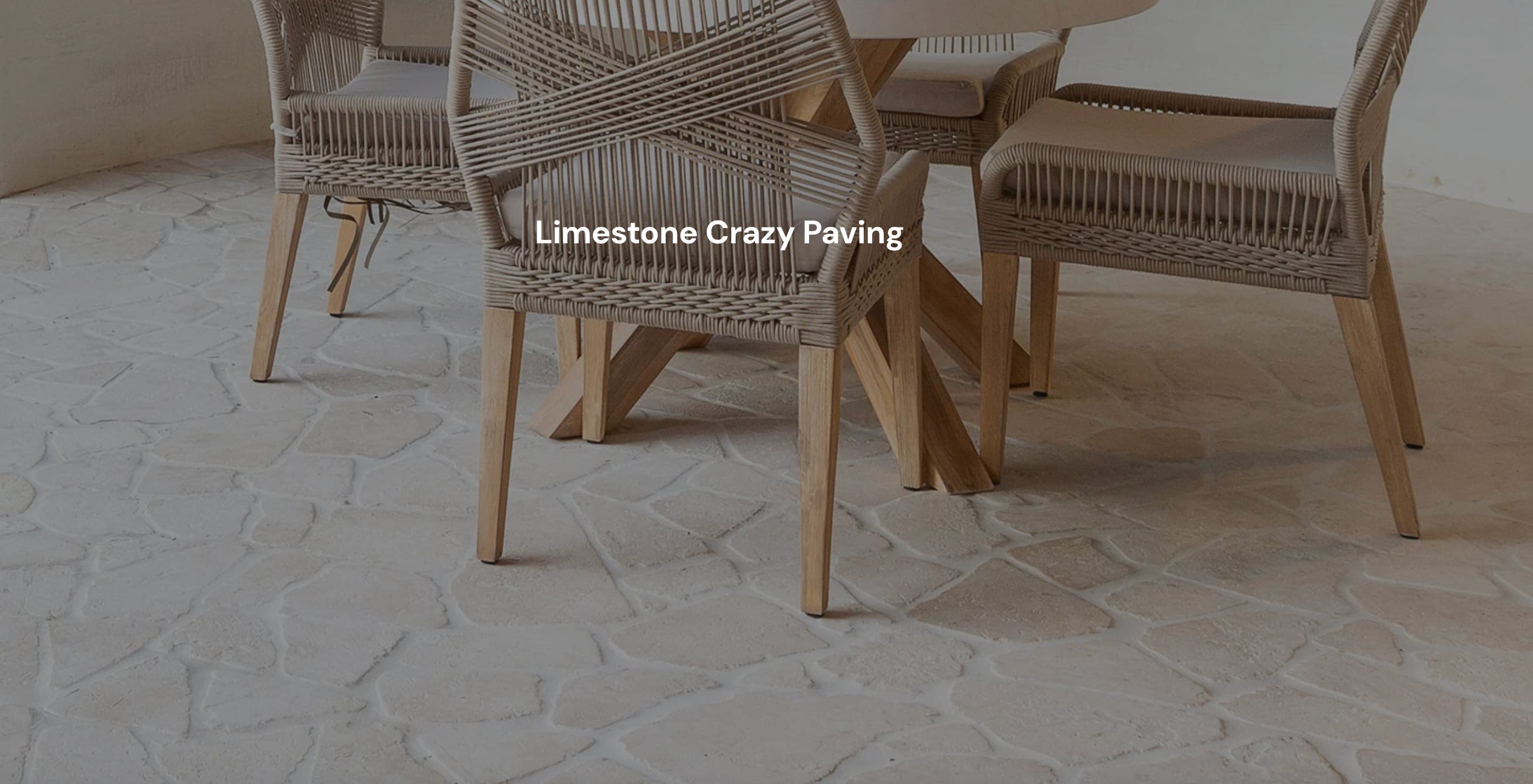
Crazy Paving
The lobby and mudroom floors at the entry to the house are going to be paved with a crazy-pave stone, in this case limestone. The cost of this (it’s not cheap) is already allowed for in the tender, since I specified it early on.
This is real stone, and I’ll have to seal it, and re-seal it from time to time. But will it look great? It will. Bringing the outside inside. Brilliant.
Alfresco Floor
The rear indoor-outdoor area which we’re calling the ‘alfresco area’ was the last choice I made today. “I don’t want it to look like a bathroom floor”, I said to Anna, and she nodded in agreement.
We considered some porcelain options which had more texture and variation, less bathroom-y. But in the end, the limestone just looked too gorgeous. I selected this stone, the same product as the crazy paved entrance, except in a rectangular format, to be laid in a “brick” pattern for texture and variety.
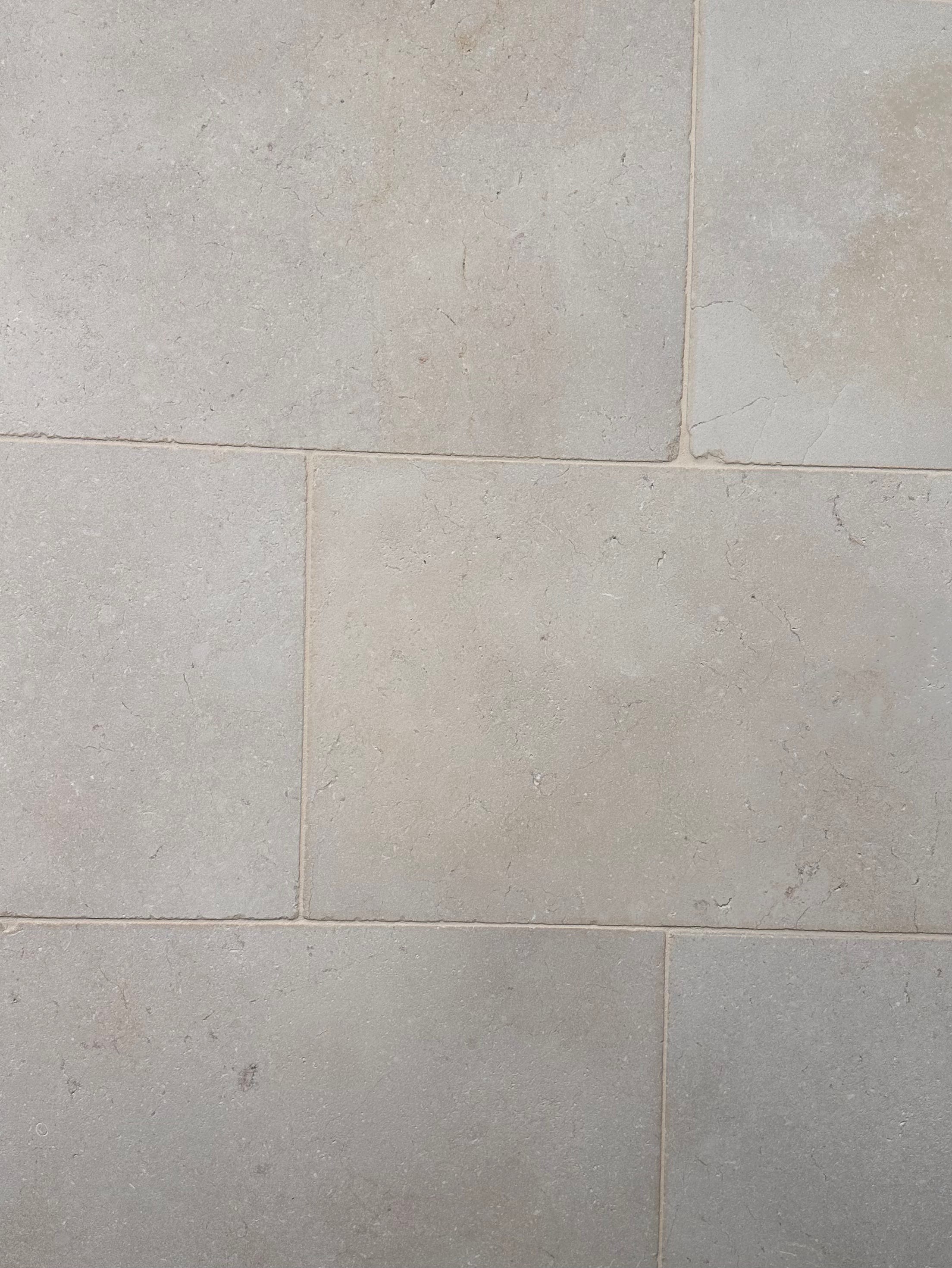
Limestone laid in a “brick” pattern
This is one choice that went way over budget—say $170 per sq. m vs. $40. Anna was helpful here, suggesting a cheaper, thinner option. “You’re not putting it around a pool,” she said. No, I’m not. $20 per m. saved right there.
It’ll look fabulous.
Bathrooms
I chose a plain-ish beige tile in large format for walls and floors in both bathrooms. Here I stayed within budget, which is a good thing, since the tiles are covering floor-to-ceiling. The goal is for the tiling to blend into the background, giving the rooms a warm feel, and letting the other features and fittings shine.
The vanity benchtops in both bathrooms are to be a brown-flecked terrazzo, and Anna hauled out some similar porcelain samples so we could cogitate. I chose a feature tile for above the ensuite vanity in the excellently named colour “Mudbrick”. When laid, it has variation and texture.
I’m going for 115cm squares, just like Harry Seidler might have chosen for the Rose Seidler House in 1950.
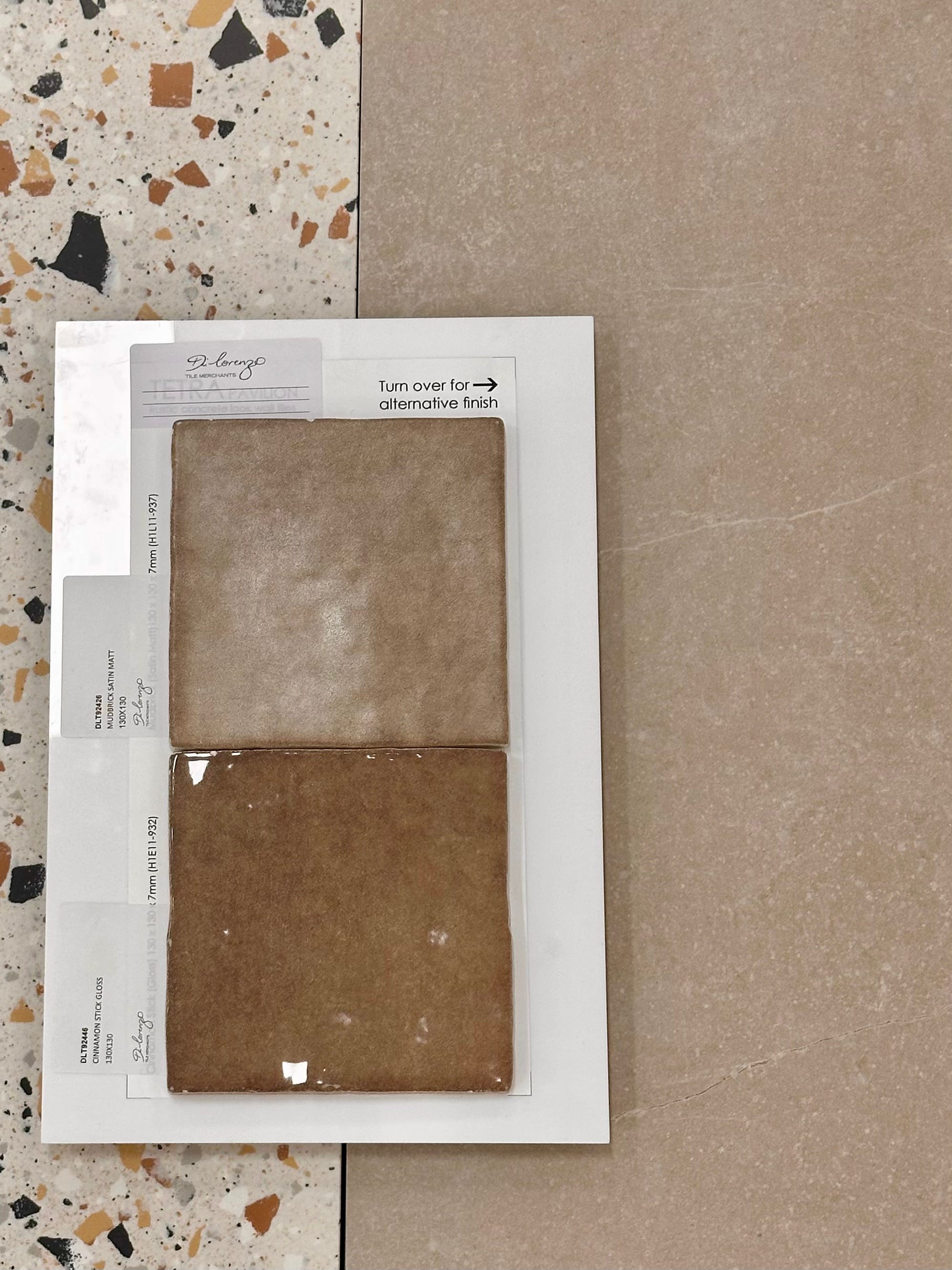
“Mudbrick” feature tiles, the bathroom wall/floor choice, and a little terrazzo for comparison
Laundry
The laundry floor will be the same as the bathrooms—within budget! And what’s more, those budget-friendly tiles are also rated for exterior use, so they can be used for the drying courtyard outside the laundry door.
As the laundry benches will be the same brown-flecked terrazzo, I needed a splashback tile to co-ordinate. The “Mudbrick” feature was too expensive for this. But Anna helped me find a lovely plain square tile in their Pixel range, in a colour serendipitously named “Mud”. Also in 115x115 cm squares.
You’ll have to trust me on the “mud” theme. It works in real life.
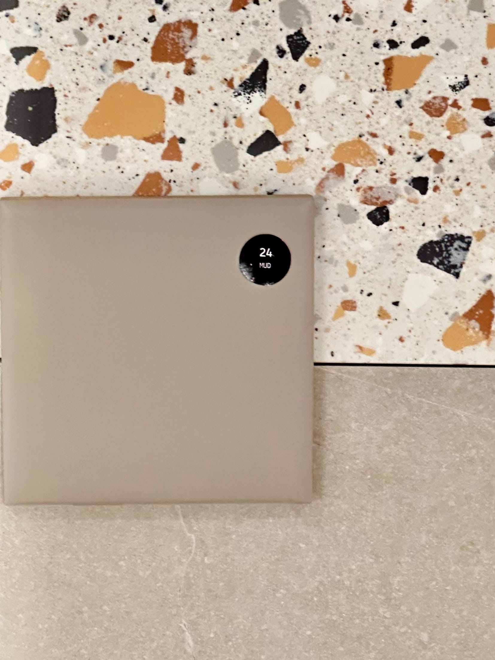
“Mud”. It works.
Kitchen Splashbacks
In the kitchen, the benchtops are to be terrazzo too, here with a green fleck. After considering many options, I chose a green version of the laundry splashback tile, in the same Pixel range. The colour is “Military”, which is not quite as evocative as “sage” or “eucalyptus” but it was the best option.
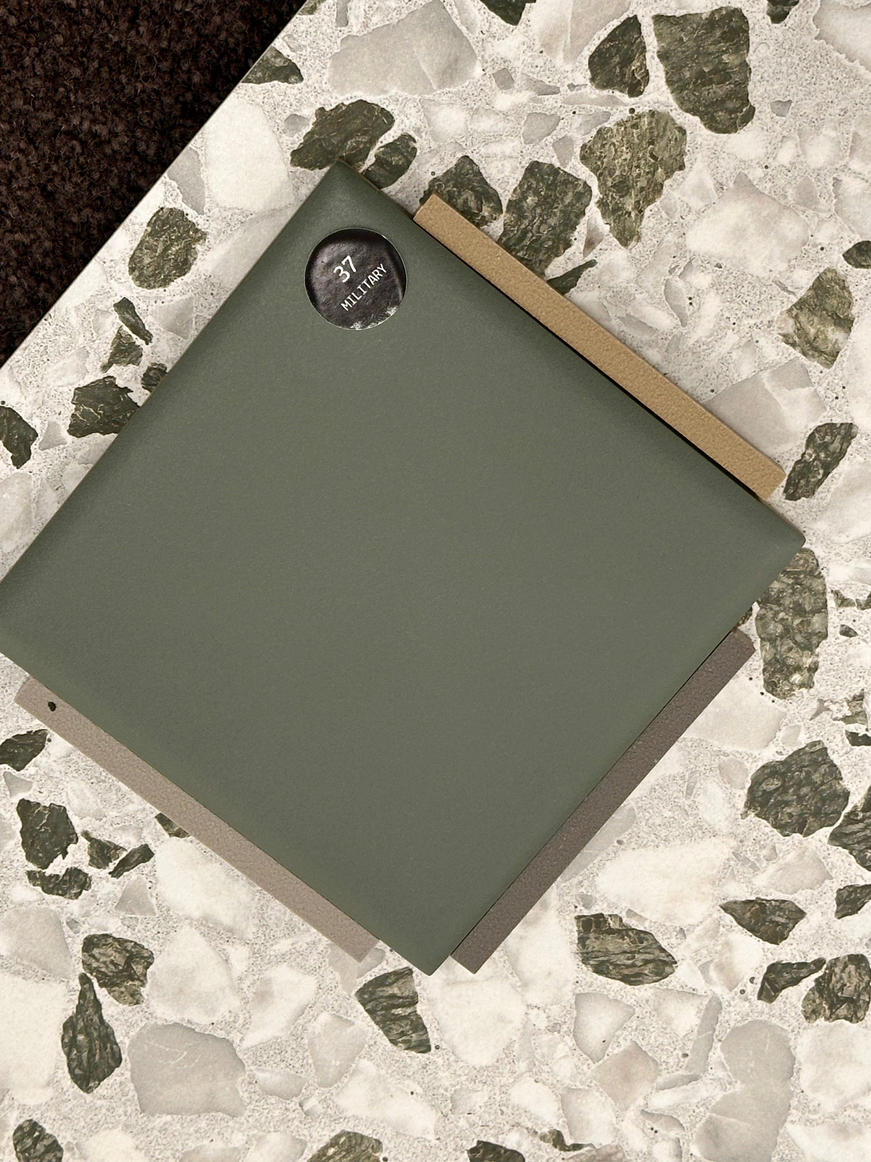
“Military”. It works too. Note the grout colour samples.
Powder Room Floor
As regular readers may recall, the Powder Room is to have vivid wallpapered walls. It does need tiles for the floor, and a skirting tile. I was ready for this one.
“You have a tile called ‘Japandi’? I asked Anna.
“We do!” she smiled. “The green is my favourite.” It’s mine too.
This tile is a much smaller square, and has a grippy surface suitable for a wet area floor. I can’t even remember how far this one blew the budget, but as I said to Anna, this is what I need to ensure the Powder Room is stunning.
She added it to the list.
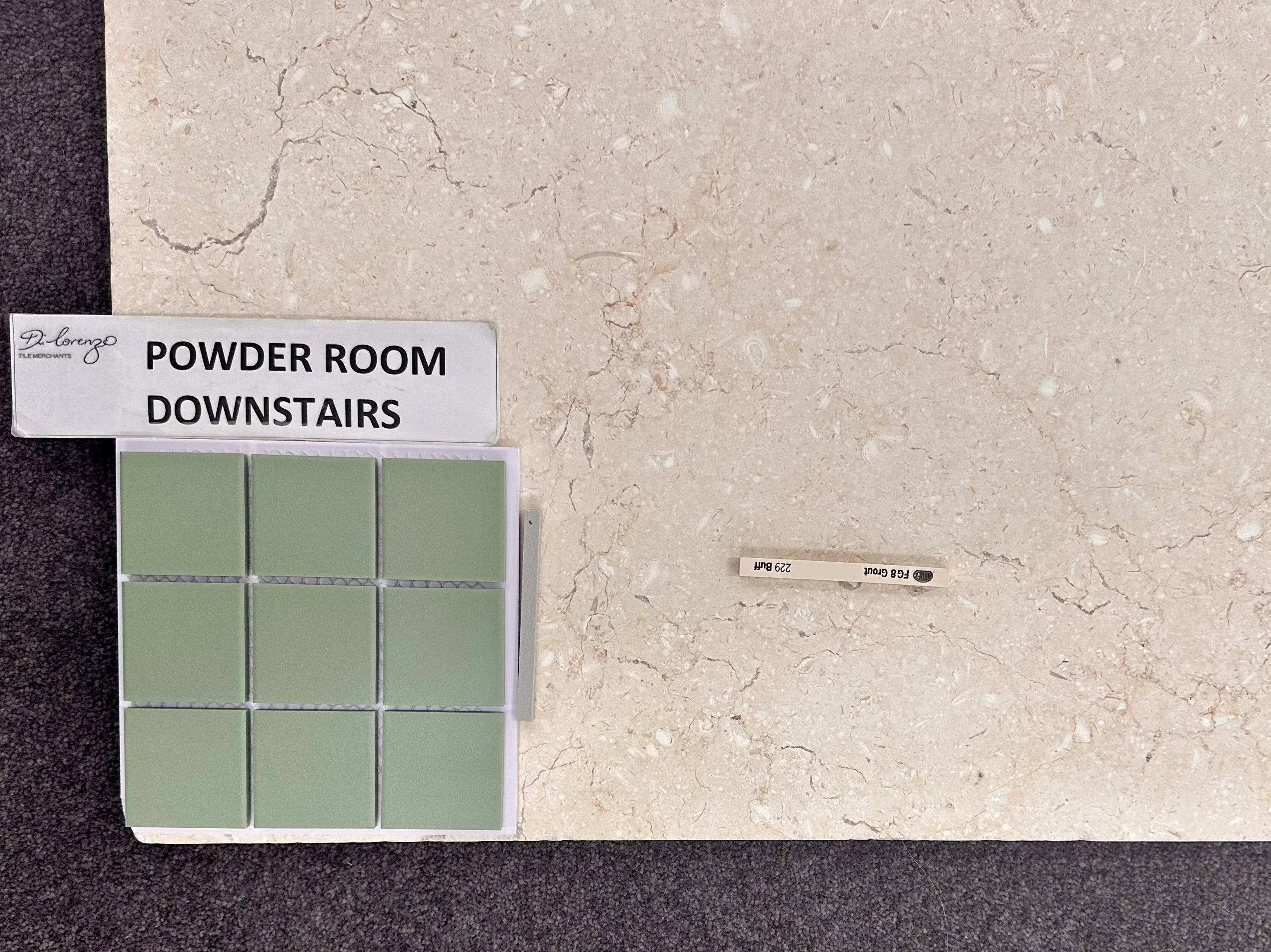
“Japandi” in Green, with Limestone & grout samples.
Grout Colours
This was news to me, but Anna assured me we needed to also choose the grout colours for all the different tiles. She had tiny little grout samples and we lined them up against my tile choices. Too light — too yellow — too grey. Very few green options. Did I want the grout to stand out or blend in?
This is where Decision Fatigue could easily have kicked in. But I’m proud to say that I managed to engage with this minuscule detail, and complementary grout colours were duly chosen. Anna added them to her checklist.

Ta-dah!
And it was done.
Anna had little labels she added to the array of tile samples we’d spread out over the showroom floor. I took photos, she took photos.
And then it was done. Just under two hours. As I said, Proud of Self.
Well done!